Customer Segmentation
Understanding the Importance of Customer Segmentation
Imagine a personal relationship. By investing time and effort in getting to know a friend, you can begin to anticipate their moods, preferences and dislikes. Similarly, it’s incredibly beneficial for companies to know their customers. By understanding and segmenting their customer base, companies can tailor their services and products to meet the unique needs and preferences of different groups, leading to higher satisfaction and loyalty.

Defintion and Techniques
Customer Segmentation is the process of dividing a broad customer base into smaller, more manageable groups (or segments) based on shared characteristics relevant to marketing such as: age, gender, interests, values, spending habits etc. The primary purpose of segmentation is to enable businesses to better understand different parts of their market and to identify specific groups that they can target more effectively with specialized marketing strategies and product offerings.
Customer segmentation can be approached in various ways, each providing unique insights into customer behavior. Techniques may include: Cohort Analysis to monitor promotions and show customer retention, RFM Analysis to evaluate recency, frequency & monetary value as well as different clustering techniques such as DBSCAN. For this project, I focused on hierarchical and k-means clustering, applying k-means on PCA-reduced customer data. This approach allows for identifying distinct customer groups.
Important distinction: Customer Segmentation vs. Personalization
Personalization, on the other hand, goes a step further by tailoring experiences, communications and products to individual customers. It involves using data about a customer’s previous interactions, preferences, and behavior to create a customized experience that speaks directly to them. Personalization aims to make each customer feel uniquely valued and understood, which can enhance engagement and loyalty.
In simple words: The objective of segmentation is to simplify marketing by grouping similar customers together; personalization’s goal is to enhance the customer experience by making it as relevant and individualized as possible.
Introducing the data
For my project, I used a rich dataset from a marketing campaign available on Kaggle.com. This dataset was originally gathered during the previous year’s promotional activities of a superstore planning a year-end sale. It contains 2240 rows and 28 columns, where each row represents a unique customer and includes information about their sociodemographic characteristics and buying habits. My entire notebook can be found on my GitHub repository. Below are the first three rows of the original marketing campaign data. By utilizing the index_col=0 argument in pd.read_csv, I set the unique customer ID as the dataframe’s index.
| Year_Birth | Education | Marital_Status | Income | Kidhome | Teenhome | Dt_Customer | Recency | MntWines | MntFruits | MntMeatProducts | MntFishProducts | MntSweetProducts | MntGoldProds | NumDealsPurchases | NumWebPurchases | NumCatalogPurchases | NumStorePurchases | NumWebVisitsMonth | AcceptedCmp3 | AcceptedCmp4 | AcceptedCmp5 | AcceptedCmp1 | AcceptedCmp2 | Complain | Z_CostContact | Z_Revenue | Response | |
|---|---|---|---|---|---|---|---|---|---|---|---|---|---|---|---|---|---|---|---|---|---|---|---|---|---|---|---|---|
| 5524 | 1957 | Graduation | Single | 58138.0 | 0 | 0 | 04/09/2012 | 58 | 635 | 88 | 546 | 172 | 88 | 88 | 3 | 8 | 10 | 4 | 7 | 0 | 0 | 0 | 0 | 0 | 0 | 3 | 11 | 1 |
| 2174 | 1954 | Graduation | Single | 46344.0 | 1 | 1 | 08/03/2014 | 38 | 11 | 1 | 6 | 2 | 1 | 6 | 2 | 1 | 1 | 2 | 5 | 0 | 0 | 0 | 0 | 0 | 0 | 3 | 11 | 0 |
| 4141 | 1965 | Graduation | Together | 71613.0 | 0 | 0 | 21/08/2013 | 26 | 426 | 49 | 127 | 111 | 21 | 42 | 1 | 8 | 2 | 10 | 4 | 0 | 0 | 0 | 0 | 0 | 0 | 3 | 11 | 0 |
EDA and Data Preperation
Exploratory Data Analysis (EDA) and data preparation were conducted concurrently, employing various techniques to both familiarize with and refine the dataset. Initial steps included renaming columns and removing 358 duplicate rows. Using df_segmentation.info(), I assessed missing values and data types, revealing several preparatory actions:
- Omitted imputation for 24 missing entries in the
annual_incomecolumn and chose to drop these records. - Calculated and appended a new
agecolumn, removing thebirth_yearcolumn. - Noted that
education_levelandmarital_statusremained as object data types, requiring further encoding.
Further mathematical exploration using df_segmentation.describe() led to the removal of contact_cost and revenue columns due to uniform distribution across their statistical measures.
For categorical encoding:
- education_level: by using a replacement dictionary I simplified classifications into ‘Lower Education’, ‘Graduation’ and ‘Higher Education’, afterwards applied numerical encoding (0, 1, 2) for model use.
- marital_status: I applied a simple function named
binary_marital_statusthat converts the ‘marital_status’ in the dataset to a binary format, where ‘Single’ is encoded as 0 and all other statuses as 1. This simplifies the encoding process by using binary values instead of more complex methods like One-Hot Encoding or Gower Distance, which integrate numerical and categorical data analysis.
					# Binary encoding: 0 (Single), 1 (Non-Single)
def binary_marital_status(status):
    return 0 if status == 'Single' else 1
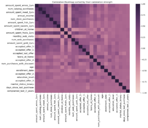
Next, I generated a correlation heatmap using df_segmentation.corr() and sorted it by correlation strength to identify potentially highly correlated features and either drop or aggregate them to eliminate redundancy.
I consolidated ‘children_at_home’ and ‘teens_at_home’ into a single ‘children’ column after identifying a negative correlation with purchasing behavior, suggesting that expenditure declines with greater family responsibility. Similarly, promotional offer acceptances were combined into an ‘accepted_discounts’ column and various spending categories were merged into a ‘total_expenditure’ column due to their strong correlation with annual income, providing redundant insights on customer spending over the last two years. These original columns were removed to refine the dataset for clearer insights, but I retained the individual spending data as ‘product_preferences’ in the dataframe for later analysis to investigate if specific customer segments show preferences for certain product categories after clustering.
Using the df.describe() method again, I observed unusually high values in the data summary, such as a maximum age of 131 and an annual income of $666,666. The age is unusual high for humans and the max income value starkly contrasts its mean, so I employed the 99th percentile approach to effectively trim outliers, ensuring the dataset reflects more typical and accurate observations.
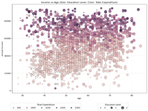
Now that the data is cleaned, I’m curious about the customer distribution. So, I’m plotting a bubble chart because it can represent three dimensions of data simultaneously (age, income, and education level), while also incorporating color to represent a fourth dimension (total expenditure). It’s a simple yet effective way of segmenting the marketing data, unlike a “simple” scatter plot which typically shows only two dimensions and may miss deeper insights. Setting alpha=0.8 ensures some transparency in the bubbles, which helps in visualizing overlapping data points clearly in bubble charts.
Age and Income Relationship
- There appears to be a cluster of higher-income individuals between the ages of 50 and 70, which suggests that middle-aged to older adults in this dataset tend to have higher earnings. This might be indicative of peak earning years.
Expenditure Patterns
- Darker bubbles (indicating higher expenditures) are more prevalent among those with higher incomes and middle age ranges. This could suggest discretionary spending ability is highest among this group, possibly because of financial stability or peak earning.
- There is a notable spread of darker bubbles across all ages in the higher income range, indicating that high earners across the board tend to spend more.
Education and Income
- Larger bubbles (indicating higher education levels) are predominantly seen in the higher income brackets. This supports the commonly observed trend that higher education often correlates with higher income.
Standardization
Standardization (also known as Z-score normalization) is crucial for segmentation models to ensure all features, such as age and annual income, are treated equally. Without standardization, features with larger numerical ranges, like income, would dominate the model, leading to biased results.
					# Initialize the StandardScaler
scaler = StandardScaler()

# Scale the numerical data
scaled_data = pd.DataFrame(scaler.fit_transform(df_segmentation[numerical_cols]),
                                      columns=numerical_cols,
                                      index=df_segmentation.index)
By subtracting the mean (μ) of each feature from its values and then dividing by the standard deviation (σ), I am transforming the features to the same numerical range, which allows the model to accurately compare and weigh differences between features.
Hierarchical Clustering
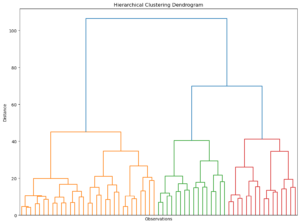
Originally developed by anthropologists to explain human origins, hierarchical clustering groups individual observations so that those in the same cluster are very similar, while being distinctly different from those in other clusters.
Using the Ward method, which minimizes the variance within each cluster and a color threshold of 50, the dendrogram reveals three distinct segments for the marketing data (approx. 2000 observations), aiding in both segmentation and explanatory analysis.
K-means Clustering
K-means is a widely used and simple clustering method. Here’s how it works:
- Choose the Number of Clusters (K): Decide how many clusters you want to identify.
- Select Initial Centroids: Pick starting points for each cluster, either randomly or based on prior knowledge.
- Assign Points to Clusters: Each data point is assigned to the nearest centroid.
- Recalculate Centroids: Find the new center for each cluster and repeat the assignment process until the centroids don’t move much.
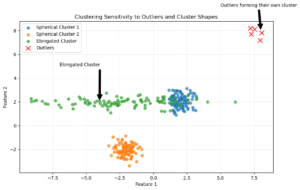
However, K-means has some issues:
- Sensitive to Outliers: Extreme values can create their own clusters.
- Cluster Shape: It works best with spherical clusters and can struggle with elongated shapes.
K-means Clustering with optimal number of Clusters
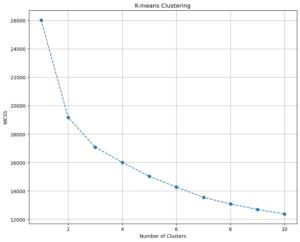
For the marketing data, I perform K-means clustering and determine the optimal number of clusters by analyzing the Within Cluster Sum of Squares (WCSS). First, I consider 1 to 10 clusters, running the algorithm for each number of clusters with multiple starting points using the K-means++ initialization method. I also set a random state for reproducibility.
					wcss = []
for i in range(1,11):
    kmeans = KMeans(n_clusters = i, init = 'k-means++', random_state = 40)
    kmeans.fit(scaled_data)
    wcss.append(kmeans.inertia_)
After running the clustering, I plot the WCSS for the different numbers of clusters. The optimal number of clusters is typically chosen by looking for a “kink” or “elbow” in the plot, where the decrease in WCSS becomes less pronounced.
What is WCSS?
The Within Cluster Sum of Squares (WCSS) measures the sum of squared distances between each point in a cluster and the centroid of that cluster. Mathematically, it is given by:
\[ \text{WCSS} = \sum_{i=1}^{k} \sum_{x \in C_i} \|x - \mu_i\|^2 \]
where:
- \( k \) is the number of clusters
- \( C_i \) is the set of points in cluster \( i \)
- \( \mu_i \) is the centroid of cluster \( i \)
- \( \|x - \mu_i\|^2 \) is the squared Euclidean distance between point \( x \) and centroid \( \mu_i \)
Lower WCSS values indicate more compact clusters.
Based on the WCSS plot, I continue by dividing the data into three fixed clusters using the K-means algorithm again. I create a new DataFrame that includes the original features and assigns cluster labels to each data point. I then calculate the mean values for each cluster and compute the size and proportion of each cluster. Finally, I rename the clusters to descriptive labels and add these labels to my DataFrame:
					# Run K-means with a fixed number of clusters. In my case, 3.
kmeans = KMeans(n_clusters=3, init='k-means++', random_state=40)
# Divide my data into the 3 clusters.
kmeans.fit(scaled_data)

# Create a new DataFrame with original features and assigned clusters
df_segm_kmeans = df_segmentation.copy()
df_segm_kmeans['Segment K-means'] = kmeans.labels_

# Calculate mean values for the clusters
df_segm_analysis = df_segm_kmeans.groupby(['Segment K-means']).mean()

# Compute the size and proportions of the clusters
df_segm_analysis['N Obs'] = df_segm_kmeans.groupby(['Segment K-means']).count()['education_level']
df_segm_analysis['Prop Obs'] = df_segm_analysis['N Obs'] / df_segm_analysis['N Obs'].sum()

# Rename clusters
df_segm_analysis.rename(index={0: 'balanced multi-channel shoppers',
                               1: 'wealthy offline shoppers',
                               2: 'price-sensitive shoppers'}, inplace=True)

# Add descriptive labels to the DataFrame
df_segm_kmeans['Labels'] = df_segm_kmeans['Segment K-means'].map({
    0: 'balanced multi-channel shoppers',
    1: 'wealthy offline shoppers',
    2: 'price-sensitive shoppers'
})

# Display the analysis DataFrame
df_segm_analysis
| Segment K-means | N Obs | Prop Obs | education_level | annual_income | days_since_last_purchase | num_purchases_with_discount | num_web_purchases | num_catalog_purchases | num_store_purchases | monthly_web_visits | age | marital_status_binary | children | accepted_discounts | total_expenditure |
|---|---|---|---|---|---|---|---|---|---|---|---|---|---|---|---|
| balanced multi-channel shoppers | 921 | 0.46 | 1.17 | 34290.14 | 49.36 | 1.99 | 2.09 | 0.55 | 3.19 | 6.45 | 52.23 | 0.76 | 1.23 | 0.18 | 96.09 |
| wealthy offline shoppers | 509 | 0.25 | 1.31 | 75265.68 | 49.28 | 1.15 | 5.02 | 5.89 | 8.29 | 2.84 | 56.06 | 0.75 | 0.18 | 1.04 | 1367.14 |
| price-sensitive shoppers | 573 | 0.29 | 1.38 | 57561.71 | 48.09 | 3.97 | 6.47 | 3.03 | 7.75 | 5.84 | 59.05 | 0.86 | 1.21 | 0.33 | 735.34 |
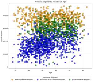
Based on the calculated mean values for the clusters, I have already interpreted the data summary and labeled the three segments. I’ll explain later on why I named them as I did. Next, I want to plot the three segments in a scatter chart, showing the relation between age and income and how the segments are distributed.
- Wealthy Offline Shoppers: They are less numerous but have significant spending power.
- Price-Sensitive Shoppers: They are older on average, possibly indicating retirees or those nearing retirement who are conscious of how they spend their retirement savings.
- Balanced Multi-Channel Shoppers: While younger, they might represent an emerging market with potential growth in income and spending as they age.
Summary of Principal Component Analysis (PCA) for K-Means Clustering
To improve the effectiveness of K-means clustering, I employ Principal Component Analysis (PCA) to reduce the dataset’s dimensionality while retaining most of its variance. By plotting the cumulative explained variance, I determined that six components capture close to 80% of the total variance, ensuring a good balance between simplicity and information retention. This selection helps in simplifying the dataset, improving clustering performance and maintaining key information.
- Reducing Complexity with PCA: This is like taking a complex sculpture (in 3D) and finding the best way to photograph it so that the photo still gives a good idea of what it looks like, even though it’s now in 2D.
- Capturing Variance: Picture plotting cumulative explained variance as a steep hill that levels off as you climb. At some point, like after climbing 80% of the hill, you’ve seen most of the view (captured most information) and climbing more gives diminishing returns (little new information).
I further analyzed the PCA results by examining the loadings of each component on the original features. Creating a heatmap of these loadings allows me to visualize and interpret the relationships between principal components and original features easily. Finally, transforming the data with PCA reduces its dimensionality, making it more suitable for effective K-means clustering.
K-means clustering with PCA
After running the following code, I’ve managed to extract the scores from the PCA, capturing roughly 80% of the variance.
scores_pca = pca.transform(scaled_data)
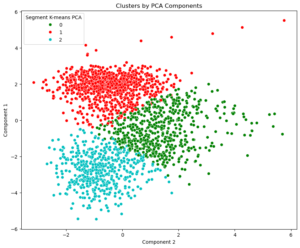
These scores will now serve as the input for the next and final phase, refining my cluster analysis with this transformed data. Basically, I’m repeating the whole process: Plotting the WCSS, which confirmed my decision to divide the data into three fixed segments; creating a new DataFrame that contains segment and component labels, mean values, etc. This time, I’m plotting the first two principal components against each other, since they capture the highest variance in the dataset.
Visually, each dot on the plot corresponds to a customer, with their position determined by their scores on these components — essentially, Component 1 can be seen as capturing the broadest trends in the data, while Component 2 captures the next most important patterns that are independent to the first.
| Segment K-means PCA | N Obs | Prop Obs | education_level | annual_income | days_since_last_purchase | num_purchases_with_discount | num_web_purchases | num_catalog_purchases | num_store_purchases | monthly_web_visits | age | marital_status_binary | children | accepted_discounts | total_expenditure | Component 1 | Component 2 | Component 3 | Component 4 | Component 5 | Component 6 |
|---|---|---|---|---|---|---|---|---|---|---|---|---|---|---|---|---|---|---|---|---|---|
| price-sensitive shoppers | 575 | 0.29 | 1.37 | 57369.38 | 48.19 | 3.99 | 6.42 | 3.08 | 7.61 | 5.87 | 59.07 | 0.86 | 1.23 | 0.35 | 739.00 | -0.54 | 1.39 | 0.18 | -0.14 | -0.07 | -0.21 |
| balanced multi-channel shoppers | 919 | 0.46 | 1.18 | 34306.52 | 49.34 | 1.97 | 2.09 | 0.54 | 3.20 | 6.45 | 52.23 | 0.76 | 1.22 | 0.18 | 95.56 | 1.87 | -0.45 | -0.10 | 0.07 | 0.03 | 0.09 |
| wealthy offline shoppers | 509 | 0.25 | 1.31 | 75361.95 | 49.20 | 1.13 | 5.07 | 5.84 | 8.42 | 2.82 | 56.00 | 0.75 | 0.17 | 1.02 | 1361.45 | -2.76 | -0.75 | -0.03 | 0.03 | 0.03 | 0.08 |
1. Price-Sensitive Shoppers
- Demographics: Older average age (59), mostly married (85.5%).
- Economic Factors: Moderate income ($57,369).
- Shopping Habits: High frequency of store visits (7.61) and web purchases (6.42), indicating a comfort with both physical and digital channels.
- Web Visits: Averages 5.87 web visits per month, indicating active online price comparison before making in-store or online purchases.
- Discount Behavior: High number of purchases with discounts (4), suggesting price sensitivity.
- Children: On average, 1.23 children per household, indicating family-oriented shopping needs.
Strategic Insights: This group values cost-efficiency and actively seeks the best deals online and in-store. Target them with digital promotions and discount offers and enhance their shopping experience through loyalty programs that reward frequent purchases. Progressive discounts, family packs and bulk buying options could be particularly attractive.
2. Balanced Multi-Channel Shoppers
- Demographics: Youngest segment, average age of 52, majority married (76%).
- Economic Factors: Lowest income level ($34,307).
- Shopping Habits: Engages minimally across channels with the lowest numbers in catalog and store purchases, suggesting possible financial restraint or selective buying behavior.
- Web Visits: Leads with 6.45 web visits per month, the highest among all segments, utilizing online platforms to scout for the best deals across various channels.
- Discount Behavior: Lower engagement with discounts.
- Children: Similar to the first segment, an average of 1.22 children.
Strategic Insights: This segment’s multi-channel but low-volume shopping suggests they are cautious but still open to various shopping formats. Omnichannel strategies like BOPIS (Buy Online, Pick-up In Store), online promotions and personalized email marketing could cater to their versatile yet cautious shopping preferences. Since they have children, focusing on budget-friendly family deals could be effective.
3. Wealthy Offline Shoppers
- Demographics: Middle-aged (average age 56), majority married (74.6%).
- Economic Factors: Highest income ($75,362), indicating substantial purchasing power.
- Shopping Habits: Prefers offline channels, highest store (8.42) and catalog (5.84) purchases, minimal web visits.
- Web Visits: With only 2.82 web visits per month, this segment shows a distinct preference for traditional, in-store shopping experiences.
- Discount Behavior: Least responsive to discount offers despite the highest number of accepted discounts, suggesting a preference for quality or exclusivity over price.
- Children: Fewest children (0.17 average), suggesting fewer family-oriented needs.
Strategic Insights: This segment’s high income and preference for offline shopping suggest that upscale product lines should be prioritized. Exclusive memberships and loyalty programs that offer unique benefits and first-access to premium products could be appealing. Marketing should focus on quality, exclusivity and customer service excellence to attract this affluent shopper base.

